
There’s been an ongoing debate in our office, and I'm often challenged with it: Do websites still need a homepage button or link?
With over 20 years of Web design experience, I've seen the Internet and how we interact with it change and evolve over time. However, there are many Web standards that have remained the same. Two of them are:
- Make your logo a clickable element to your homepage.
- Provide another way back for your users with a "Home" button, text link or icon.
Depending on what you read or who you talk to, you'll most likely get a different opinion on homepage buttons. Most younger Web designers will argue that, "Everyone knows the logo is clickable to the homepage, so why do I need to add another link in the header or navigation area of my website?"
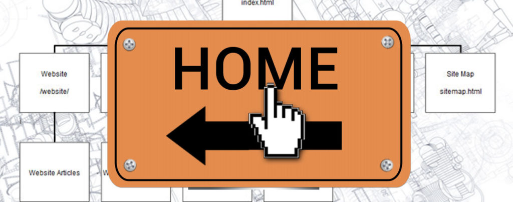
Okay, I'll agree with them that over the past five years, there's been an ongoing trend towards leaving a home button off a website. But does this make it right? Should we always follow every trend or pattern? I've been searching for the golden blog post or whitepaper to answer this question, and have yet to find it. So I'll answer it myself. Do websites still need a homepage button?
The short answer is yes, and here's just one important reason why: Due to the growth and intelligence of search engines, your homepage may not be the first page a user visits. The first click could go anywhere – a subpage, a blog post, a form.
So the questions now become ones of integration. Where's the best place to put a home link? How should you present it? Button? Text link? Icon? Navigation item? After researching how some top brands are handling things, two things became very evident:
- Not all sites had a visible/obvious homepage button in their headers or main navigation bars.
- Every site provided a way back to the homepage in some form or fashion.
Here are a few of the many visual examples I came across during my research:

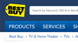
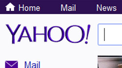
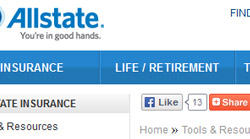
These big brands have varied demographics and tons of website traffic, so if we follow their lead, then we should implement some way for users to get back to the homepage. If you can define your demographics, you may be able to make some general assumptions about your own sites. Start by asking yourself the following questions:
- What demographics are you designing for?
- What generations do they fall into?
Let's break down potential demographics by generation:
Baby Boomers (1946-1964)
Characteristics: Very late adopters to the Internet, skeptical of every link clicked on and generally opposed to change. Unless it says "click here" or is styled as a traditional, underlined, Web-blue hyperlink, they probably don’t know it's something they can click on.
Result: They're looking for an easy way back to the homepage. Provide them with an obvious "home" button or link. Placement should most likely be in the header or main navigation.
Gen X (1965-1979)
Characteristics: This group didn't grow up on the Internet, but will be more familiar or comfortable than baby boomers. Depending on how early they adopted the Internet, they may or may not know the logo is a clickable homepage link.
Result: Probably best to error on the side of caution by providing them with a "home" button or link. However, during my own survey of individuals falling into this category, 90 percent knew to click on the logo. I was actually surprised by this.
Gen Y (1980-2000)
Characteristics: The Millennials. They get it. They grew up with the Internet. They click on anything. They know the trends, and will figure out way back to your homepage.
Result: It’s pretty safe to say they know the logo is clickable and directs to the homepage.
So where does this leave us?
Your website is your most important marketing tool, so why even chance it on guessing what your users want. Remember the old adage: "If it ain’t broke, why fix it?" There are some Web standards/patterns that have been with us from the start, and users have become accustomed to them. Why take them away for the sake of design? It comes back to one of the best books ever published about Web design, "Don’t Make Me Think". In it, Steve Krug points out that the more a user has to think, the more annoyed they get and bounce off the page to another website. I don’t think this is what you want.
The goal is to always provide the best possible user experience. Don’t blindly guess what that is; it can bite you in the end. I think it’s safe to say we should provide users with an easy way back to the homepage. If you can clearly identify your key demographics, you’ll at least have some good information on what kinds of solutions you should be integrating. At the very least, I’d recommend always leaving a bread crumb of navigation on subpages to provide users with an easy way back to the homepage.