
When designing a website, one of the very first things designers need to consider is the site's audience. Are they younger or older? Tech-savvy or not so much? Men or women? Affluent or middle class? To build a successful website, all of these questions need to not only be researched thoroughly, but should also be on the designer's mind through every step of the design process.
It's easy to overlook the fact that not all Web users are as tech savvy as the designer behind the scenes. Usability is crucial on the Web, especially when designing for a unique user base that can range from young children to elderly adults. Today, we'll focus on what to keep in mind when designing a website for older users.
With many of today's top Web designers being young, creative minds eager to push the boundaries of design, it's all too easy to overlook the user's needs. This is especially easy to do with websites whose audience may include one of the largest generations in America – the Baby Boomers. Currently ranging in age from 48-66, Baby Boomers are responsible for well over half of all consumer purchases made in the U.S.
With such a huge consumer base out there, the amount of websites that disregard this demographic is staggering. Of course, designing for an older crowd can be a true challenge. To help out, I've put together a list of six guidelines to follow in your next quest to design an easy-to-use site for this unique generation.
Trigger emotion, not frustration.
Older users are used to connecting with people, not machines. Your Web design needs to have a sense of warmth and humanity in order to appeal to this demographic. Colors, photos and font choices can all have this effect on users. Soft, muted color palettes and images of happy, satisfied people similar to the user's age, gender, etc. can all be used to help achieve a positive emotional response.
Keep it simple
When designing a site with an audience of older users, this isn't the time to pull out your fancy CSS tricks and Flash animations. These flashy, moving elements tend to confuse and distract older users, and can often end up looking more like advertisements than content. Keep the organization familiar and the text easy to read. Online users, young or old, don't spend time reading large chunks of text, but rather scan for important information. Breaking up written content with large titles and section headings is a good way to let your users digest all that information.
Let your users control font size
The design process can easily get hung up on the big, visual elements. These often require small, artsy fonts many users struggle to read. Since the textual information is often the most important content on a site, make it large and in charge, or give the users some control over it. Jakob Nielson suggests designers consider adding a button that loads an alternate stylesheet with larger font sizes since that function can be hard to find in the browser itself.
Along with text size, color and contrast play a huge role in both readability and usability. Keep the contrast high (black text on a white background reads best) so your users don't have to strain their eyes. These rules are especially important for links.
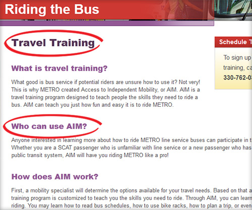
Here at Evolve, we always keep core usability rules in mind. A good example of breaking up large amounts of text can be found on Akron METRO's site, as seen below.
Clicking is key
Most sites work to drive users to perform a specific action. Whether that means uncovering information, purchasing a product or paying a bill, the important links and buttons that need to be clicked must be emphasized. For text links, make sure the font is large enough to read, as well as maintaining extra spacing between links so users don't accidentally click the wrong one. Also, be sure to visually distinguish between visited links and those that have not yet been clicked. Always let your user know where they are and where they've been.
Clickable icons and buttons also need to be big and appear clickable. With older users, be careful with dropdown menus and other types of "moving" navigation, as they can be difficult to interact with.
Nielson says, "Search is the user's lifeline when navigation fails." This is absolutely true, and a fallback for many users, so it's important to provide an obvious search function that's flexible enough to accommodate plural and past tense words, phrases and common misspellings. Not finding what you're looking for on a site can be a big frustration, especially for older users, so designers and developers need to work diligently to avoid this by facilitating good functionality and effective design.
If it isn't broken, don't fix it
This global rule is golden. When it comes to the Web, there are several key elements of a site that have come to earn their keep. Global navigation, search bars and "Contact Us" links are all examples of elements whose style and placement should not be toyed with. Where do most users expect to find the search bar? In the upper right hand corner. The "Contact Us" link? If not included in the global navigation, it should be at the very top or very bottom of the page. And how about that global navigation? Always at the top of the page. Sticking to these principles that have slowly formed over the course of Web history is an integral part of designing a usable website. These rules apply to all user demographics, but are especially important when it comes to designing for an older crowd.
The Takeaway
When designing a website, no matter the audience, the above elements are vital for a smooth, error-free user experience. With older users, these basic rules are even more important to ensure the user moves effortlessly through tasks on the site and isn't walking away frustrated. The challenge of designing for a unique user base is one that every Web designer will face in his or her career – it's just a matter of focusing on the user's needs and keeping the basic rules in mind.